This week, the lecture briefly covered what is expected from us in our next few assignments. We have 3 projects to work on oer the next 12 weeks.
- Post Project Report: a written report to include everything we want the lectureres to know about our sites, what we did and how we did it.
- Viva: a 5 minute presentation about our websites to include slides. Delivered infront of Chris, Nick and the class :/
- Major Project: constructing and launching our MP websites.
Overwhelming is a slight under statement. The main message I took from the lecture though, is that it's achiveable as long as we plan and apply effective time management skills. It's a lot of ground to cover so following the Gannt chart I created for my Major Project Proposal, i'll be concentrating on the design on the site this week, starting with font and colour schemes.
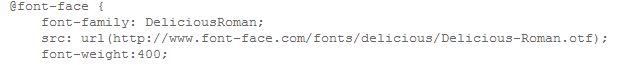
I wanted to use @font-face to find the perfect font for my logo and main body text but the site is still under construction. I did find a useful bit of code showing how to embed a web font in your CSS document.
 |
I'm looking for a type face that is cross browser compatiable, is free to download and does not require a liscence. I think the best sites to find what I'm looking for are FontShop, Font Squirrel and Fontex.
I have been searching Pop Art and comic book style fonts for the past lot of weeks. I still really want to use a comic book style design for my site but the arguement that this would seem more like a website deadicated to Roy Litchenstien and not a website about various artists still stands. Therefore, I used words like modern/contemporary and art to search for fonts. I came across a great font category on Font Shop...'Period'. As 1950 is the year Pop Art was born, I headed straight for that library! Here are a few of the font's that caught my eye...

I like the clean, clear manner of this font. It is contmeporary and still has that 'comic-book'
look while not being too representitive of that particular theme. I
think it would be a really nice type face for the logo and main body
text.

This is similar to the text above but has a more ridgid look. I particularly like the little dotted detail throughout.

I think this is my favourite out of the three. It has a real 'Pop Arty' feel to it. To me, it really illustrates the word 'POP' as it's big and bold and right in your face. I think it's too animated to use for the main body text but it would be great for the title/logo of the site.
Colour Schemes
I found brilliant Pop Art colour schemes on allpopart.com. I want the site to be bright, quirky and fresh so chose the best four that represent this.
'Bright'

'Modern Pop'

'Smokey'

'Trendy Pop'

I really like the colours used in the 'Trendy Pop' scheme. I have settled on using this throughout my website. I will be using Photoshop to experiment using the colours for various sections of the text e.g. green background, black text and blue information boxes etc. I also used Photoshop to get the exact RGB values of each colour but I think I will reduce the amount of colours to 4 as I will have a lot of interactive elements within the site so don't want it to look too busy.
Green : R - 197 G - 224 B -21 Blue: R - 20 G - 163 B - 223 Pink: R - 226 G - 0 B - 126 Black: R - 0 G -0 B -0 Supervision
After explaining to Gabriel what I was planning on getting up to over the next week he agree that it was a good approach but rather than researching and browsing fonts, colour schemes logos etc, he would like to see the branding of the site comming together and would preffer see my chosen fonts etc rather than ideas.
He also suggested that I start gathering my content as I have a lot to cover within the site. I need quality content on the general background of Pop Art and for each individual artist that I have chosen to write about. This all needs to be re-written in my own words to avoid plagerising. I will draft the content with pen and paper before typing it up. After researching the topic in depth, I will be using my own knowledge of Pop Art as well as known facts (dates, times, names) for the content.
I definately need to use a CMS as my site will contain an interactive blog, members log in area and online shop. I have settled on using Wordpress and will develop my own theme. I may use HTML5 and CSS3 in the background to design a really nice layout.
|