This week we had a crit session. Nicklas
explained how some blogs needed a bit more content and layouts now some needed
their layouts tweaked a little to make the content easier to read. He also
asked if people were making their own Tumblr/Wordpress themes and if so, to
credit it at the bottom of the page so they could consider this when marking
our work.
I applied what Nick had said to my blog. I like
the layout but when reading it, to make it flow better and look neater, I added
some breaks after a few lines of text so that they're is no need for continuous
scrolling. I'm using a Tumblr theme but personalised it with my own header. I
designed the header in Photoshop and based the design on my Major Project
theme, Pop Art.
After evaluating my research so far, it's clear to see that Pop
Art has the ability to remain fresh fun and persistent as it is still
being used by the most iconic pop stars today and is still current in
fashion, music and design.
This has re-established my belief that a website based on this
topic would not only be a great source for all things Pop Art, but that
the site also has the potential to generate and sustain a great number
of users as the art form is still relevant and continues to inspire
various forms of media.
I studied German Expressionism as my chosen film genre for my
Moving Image Arts A-Level project. I can see a likeness in GE and Pop
Art and it's the same things that attract me to both. Like German
Expressionism, Pop Art uses strong shapes, abstract/distorted scenery
and colour to express its art in a
way that is striking. Using these characteristics of Pop Art, I have
the opportunity to design a site that's creative, fresh and quirky.
I took the advice from week 4 design lecture and began some
paper prototyping. I prefer this method of preparation as I find it
easier to sketch my ideas, scribble out mistakes and add in bits and
bobs. I find this way shows more of my thinking process, especially
during the early stages of development. Once the kinks have been worked
out I can then develop them using software.
Design Concept 1: Inspired by Lichtenstein
Roy Lichtenstein was one of the leading artists of the Pop Art
era. Born in New York, he began painting at the age of 14. At the start
of his career, he experimented with many art forms and techniques before
the old fashioned comic book style became his main subject matter. Two
of the first paintings he created using this style were the ‘Ten Dollar
Bill’ and Mickey Mouse/Donald Duck paintings.
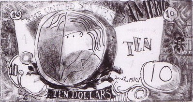 |
| 'Ten Dollar Bill' |
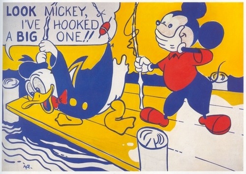 |
| Mickey/Donald |
The elements he used to create his comic book style paintings
are what attract me to his work. I love how he tool inspiration from the
Cubist and Expressionist art movements and created paintings using
thick lines, expressionist brush strokes, bold colours (pink and blue in
particular) and Ben-Day dots to depict an abstract look. These, along
with lettering and speech balloons became his signature techniques.
The graphics used in Belfast City Council's current anti-litter campaign have been inspired by the Lichtenstein comic-strip style.
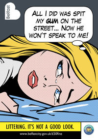
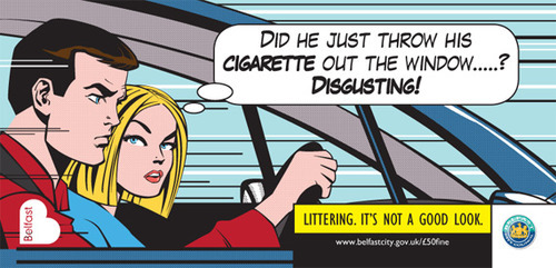
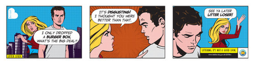
So why have they used Pop Art in this campaign? Councillor Ian
Adamson, chairman of the Belfast City Council's Health and Environmental
Services Committee, said;
“The pop-art images have got people talking and that’s exactly what we were hoping for. People have been discussing the campaign on the council’s Facebook page and it’s great to get their feedback.”

The
images used in the campaign resemble one of Lichtensteins more famous
pieces of work, 'Drowning Girl' 1963 which now hangs in the Museum of
Modern Art, New York.

Creative Experimentation:
After taking some inspiration from Lichtenstein's work, I decided to start sketching some ideas.

As mentioned, one of Lichtenstein's signature traits was using speech balloons and comic lettering. Some of the words that people relate with his work are 'Ka-pow', 'Whamm', 'Blam' and 'Zip'. I decided to incorporate this technique in the navigation design. I practiced sketching the words and then roughly sketched my comic book style website complete with speech balloon navigation.


